I’ve been designing logos for a while now, and I see a lot of logos designed by other people or worse, cheap services. I must say most of the logos I have been seeing lately have been simply embarrassing for the company. By no means, and I the only person that thinks that way, nor am I a God of logo design. However, I have a few suggestions on how to make a good logo for a client if you are a designer, or things to think about if you are looking for one.
Budget
Of Course, first thing is to find out is what the budget is. If you or your client says anything under $250, you may has well stick with a font only. If you want to have an icon and have it be professional, memorable and most importantly unique, it isn’t going to happen for $75. If you think it will, you not getting anything original, I promise you.
If you don’t have a large budget and looking for a designer, then consider trying to approach a college that offers graphic design. There are a lot of online companies promising logos as cheap as $5, and it doesn’t take a rocket scientist to realize that is not going to produce quality. Experience and originality cost money. If you wouldn’t pay $5 for a car, they you shouldn’t be paying that for something that will represent your company. Cars can range from $1,000 to $1,000,000, and just like logos, luxury comes at a cost. If you want a big agency with accumulative experience, doting over your every thought, expect to pay for it. Otherwise, look for smaller independent freelancers or graphic design firms with reasonable budgets. There are plenty of designers in the range, you just have to put in the work and get your estimates.
For beginner graphic designers, be sure to educate your client on cost of printing, colors and find out where they will be using their logo. I have had clients call and request a gold logo, only to crush their dreams after they found out the cost of what it costs to print gold foil. After explaining to them, you have to mimic gold with gradient on digital, you will have to do the same for print. Gold ink is available, there are newer services coming out with foil options, but again, Pantone costs quite a bit more than CMYK to print. Perhaps educate and then suggest alternatives to when they require CMYK printing so they feel confident in their brand. Give them an idea of what things costs to keep it in perspective.
Colors
Spot color is when part of the logo uses an exact ink color that you specify (sometimes referred to as a Pantone) Each color must have an exact color number to be printed. Printers will have books of colors that you can specify what colors you want to use. The printer will create a plate for that color and other plates for other colors. SO, each color you choose will be a plate.
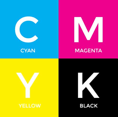
The other way to print something is process, or 4 color. It is always more cost effective. CMYK consists of cyan, magenta, yellow and black. The patterns that this color pattern forms will attempt to match a process color. Just like the printer in your office, CMYK is a universal ink color that is used to make up the rest of the rainbow with print. CMYK has four plates in total. Printed items like photographs and complex graphics are printed in CMYK.
CMYK can make up all the colors except metallic color (unless you are going to try and mimic it with a gradient). These replications of colors are not as true as spot colors, as one is literally ink of that specific number, the other is trying to be a close relative. Sometimes printers will have a side by side swatch book to show you the difference, Pantone on one side, CMYK on the other. You can always mix the two. Some print a 4 color for a brochure with full photos, then put a Pantone spot to use in place of reds and oranges which are the hardest to replicate in CMYK.
Know if it’s your “thang”, graphic designers!
Make sure that you know what you are doing before you take on this kind of project. Maybe this isn’t your specialty, and that is okay. Ask around before diving into print and corporate identity. Unless you are doing it free of course, and don’t mind arguing with printers for long hours. If you are also doing printed materials with the client, try taking charge and finding a printer that you can work with on the project. They may be able to help you avoid mistakes. A physical proof is worth a thousand….dollars.
Remember, keep the design simple, make sure it can be resized under 1 inch without losing resolution. Print it out on a laser printer and make sure it is clean and not pixelated. Look at the big boys logos, Intel, Apple, Microsoft, Adobe, AirBNB etc. Their logos are quite simple, and they can be recognized easier because of it. You also want to make sure it isn’t cluttered.
Once you find out what you have to work with. Most people will want a one or two color logo. The easiest way to make sure your client is concentrating on the design and not the colors, is to design it in gray-scale. I use Adobe Illustrator to create the logo, then I take it into Photoshop, convert it to gray-scale and then show it to the client. I use variations of grays for each color so that the client knows that it is multi colored. Try to give your client a few variations of each design. This will give them the idea that you can always manipulate the design you have created. Nobody likes a “Mr. Potatohead” logo, but often by showing them additional fonts or versions, you will get to what makes them happy quicker.
Don’t let your ego get in the way either! This is ultimately their logo. If they want it in Comic Sans, and you have already spent an hour explaining why that is the worst idea you have ever heard, you need to know how to pick your battles. It happens to ALL of us. Of course that font should be eliminated from the planet, so if you must battle, approach it from a place of professionalism. Don’t offend them because clearly they liked something about it. Say something along the lines of “I feel that this font is not as professional as the image you are trying to portray.” Or, “in my opinion, it seems to distract from the icon”. Show them examples of logos that are successful and go over why it works. Otherwise, get some books on how to put that ego in check if you have to. It is their logo, not yours.
That doesn’t mean to just agree with them on everything either. They hired you to give them advice, so that doesn’t mean being shy and saying yes to something you find repulsive. Due to the nature of corporate design, you will sometimes end up completing a design you do not like. You don’t have to put everything in your portfolio. However, I have some logos in mine that were not my favorite, but at times it is on my new client’s top five list. Just like with music, we all like different styles.
Lastly, supply your client with a brand specification guide which outlines all of the various logo usage, CMYK conversions and Hex colors for web. You want them to walk away with their files knowing what each is for, how to use them and a very easy breakdown of how to recall what each is for. Store their logos for a period of time, and make sure to let them know when that period will expire. Logo design is a very difficult task, like taking a novel and making it a haiku, but ultimately you want them to walk away smiling and tell all of their friends about you!
Author: Gina Hutchings, Chicago, IL – Lunar Media
