Don’t forget, typography and typographers existed long before the computer revolution.
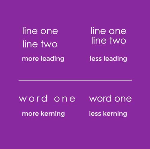
Terms common to digital typesetters such as leading, kerning, and points find its roots in handset metal type. Classic faces such as Garamond, Baskerville, and Bodoni were set in metal in their original states and have been revitalized in digital formats by companies such as Adobe. What is generically known as line-spacing and word-spacing refers to leading and kerning, respectively. Although typefaces can be categorized into dozens of families, the common lowest denominators are san-serif and serif faces. Serif typefaces, such as Garamond, Times, and Bodoni, have little hooks at the terminating end of letter strokes.
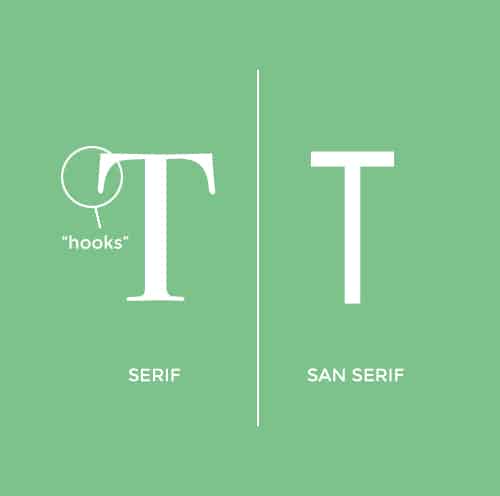
San-serif faces, such as Helvetica, Futura, and Gill Sans, lack these hooks. Based on cultural upbringing, the use of serif or san-serif faces aid in the readability of text. Since books in America are commonly published using serif faces such as Baskerville, Americans have an easier time reading long texts set in a serif face. Europeans on the other hand have been subjected to San-serif faces and find the clean geometry of san-serif easier on the eyes.
In the end, personal preference plays the deciding role. Whether the organic nature of serif type, or the geometric nature of san-serif type, is preferred, leading and kerning plays a key role in readability. Generous leading, especially in long lines of text, allows lines of text to be differential. The space between letters and words helps the eye group letters into words and words into meaning.
With the invention of computers, typesetting fell into the hands of the public. Conveniences such as auto-leading and auto-kerning have improved efficiency. However, they cannot replace the skilled eye the results from a designers practice. Choosing an appropriate typeface involves interwoven factors. The readability and legibility (and yes, they are both different) is always a priority. The look and feel of the typeface can lead to an audience’s perception of what is being presented. One may be concerned with attracting only a young audience, a certain age demographic, or one that is mostly male/female, or simply, everyone in general. The choice of typeface can appeal to one audience over the other. Whether gravitating to the polar of elegance or abstraction the choice of a fresh typeface can help attract a reader’s eye. These considerations, among others, are far from “auto.” Rather, they are problems which designers aim to solve.